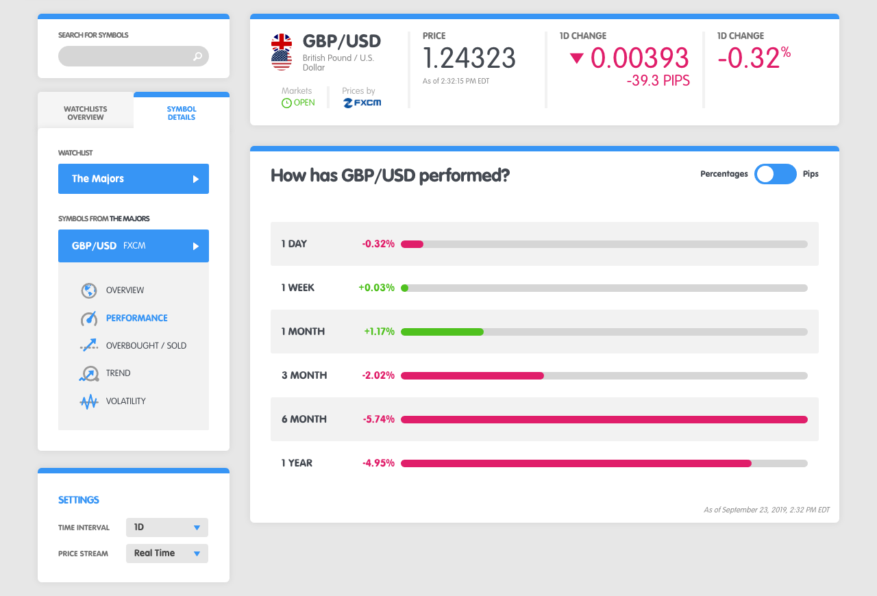
The "Performance" screen under the Symbol Details tab summarizes how a currency pair has performed over different time ranges. symbol-performance.png254.9 KB The example above shows the price performance of GBP/USD over different time frames ranging from 1 day to 1 year.
Being able to view performance across different time frames allows you to easily gauge the absolute momentum of a currency pair.
Trading absolute momentum is a technique where the price of a currency pair is compared against its own previous performance and if performance is positive (or negative) across multiple time frames, then positing (or negative) momentum is considered strong and will likely continue to persist.
For example, we can see that GBP/USD above has negative returns over the previous 3 months, 6 months and 1 year.
GBP/USD is exhibiting pretty strong negative momentum and the path of least resistance for it seems to be further downside. If the 1-month time frame had also been negative, the negative momentum would be considered even stronger.
In a nutshell, the more green bars you see on the chart, the stronger the positive or bullish momentum is for a currency pair since performance has been positive over different time frames.
The more red bars you see on the chart, the stronger the negative or bearish momentum is for a currency pair since performance has been negative over different time frames.